|
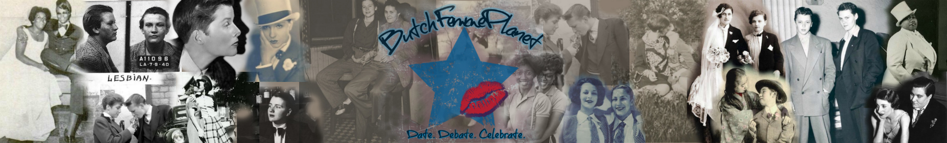
Something I just noticed..the very logo of the site
Hi, everyone:
Before I begin, I want to be very clear that: 1) this is not a criticism of Medusa and Jack, far from it; 2) I am not trying to start shit (well, a civil discussion is always OK ;)); and 3) I'm not asking for any changes to the site, as that would be a programmer's nightmare. Recently there's been some heated threads, and threads gone awry due to a sexist comment or so. And as always on a site like this, there's usually a heavy thread about sexism or oppression. One "theme" that's discussed often here is "Butches need to be like x, y and z" and "Femmes need to be a, b and c", usually superficial stuff. Closely related is "Femmes want butches who do e, f and g" and "Butches want femmes who do k, l, and m". By and large, whenever that sort of thing pops up, I think we do a pretty good job of handling it. I think as a community, we're getting away from sorting everyone into "butch" and "femme", and dealing with everyone as an individual. Many of us just can't or won't be boxed into any grouping, despite the site name. I suspect that some of us are really here for broader support for being gay, and not to be any one label. That's why I just noticed the logo of the site-that "butch" is in heavy black writing, sort of "plain", almost, and "femme" is in pretty pink and really curvasive writing. We've just had several threads about how not every butch is masculine or even tomboyish, and I'm a prime example of a "femme" who wouldn't be caught dead being girly and pink. I guess I'm just surprised and even a bit amused that the logo itself is very "binary". I am NOT trying to offend or begin a huge fight, but I just felt I wanted to speak out and say "Hey, did anyone else see this?" |
Swirly logo
It's funny cause once upon a thread butches and fellas had requested that the B be bolder... It's grown on me the pink and green and this logo is wayyyy more aesthetic compared to the original.
I can't remember why the color scheme came about but I do like the style of the letter f, not sure why and love the use of black cause it's one of my fave colors:) |
Yes, I have actually studied the logo on countless occassions. The pink, green and black circles on the outside ALWAYS remind me of Spirograph. Gawsh there I go thinking games and play again... lol. I am guessing this is the orbit part of it all... And how pink highlights the F, the word femme and the word orbit. For some reason I find the Orbit in pink to be of greater interest to me than the F in pink. I also find it interesting that the choice of color was green and not blue but then again I have my own idea as to why it is...
I would be interested to know the reasoning and meaning behind the logo, the colors, etc. |
They work on stuff for hours
Some herstory
http://www.butchfemmeplanet.com/foru...ead.php?t=2219 Quote:
|
I remember June spent days, if not weeks, looking for the perfect "f." I think it's an interesting observation and I, too, have noticed it from the beginning. I'm not offended by it, nor do I think there was an ulterior motive in choosing one font or color over the other. sometimes graphics are graphics with no intention behind them. :)
|
I pulled this from the link The Lady Snow provided because it looked like it might help to explain what you're seeing (emphasis mine). :)
Quote:
|
There are arguments to be made for and against the logo, as there are arguments to be made for or against hundreds of topics, and we argue them every day here on the planet. The argument about the logo may turn out to be fun, but that is not the part of your post that I want to respond to. I want to respond to the quote below.
[QUOTE=guihong;636043]Hi, everyone: I think as a community, we're getting away from sorting everyone into "butch" and "femme", a. nd dealing with everyone as an individual. Many of us just can't or won't be boxed into any grouping, despite the site name. I suspect that some of us are really here for broader support for being gay, and not to be any one label. Forty years ago I was ridiculed at lesbian/gay woman/women who love women/whatever, gatherings for being femme. Butches were pretty acceptable because everyone looked butch. But if you SAID you were butch or that you like femmes, you faced the same ridicule. It was explained to us butches and femmes in almost the same words you use above that we, our identities, feelings, attractions, were passe' If you or others here are neither butch nor femme, if you are here for broader support, that is fine, and welcome to you. But I am here for support for being femme. I am here to figure out where I fit in the world - following the death of my FTM husband. I was perceived as straight while we were together, but that role no longer fits. And following the years when I finished raising my kids alone ... when I was mother and father, taxi driver, financier, tutor, cheerleader, and disciplinarian. My youngest moved out a month ago so that role no longer fits either. Broke up with my FTM boyfriend a few months ago, so i am on my own entirely. Now I'm rattling around in a house designed for six people, and venturing out for the first time in many years into the gay community trying to answer some very big questions for myself. I am finding support for this journey from ny butch/femme people here. Who am I? Time will tell. But I start with the knowledge that I am femme. You're right, we should not label each other. But the people who told me butch/femme were "old time" forty years were wrong when they said the community had evolved beyond butch/femme, and I think you're wrong too. We are not butch or femme because someone has sorted us into a box. We are not looking for a solution that will release us as if we have been imprisoned in our chosen "role." We choose our path or are born into it. We have our struggles, but we're proud of our history and hopefull for the future. We SELF-identify. We like who we are. There are lots of lesbian sites and gay sites. I can't speak for everyone, but I know that I am interested in this site BECAUSE it is a butch/femme site. I am femme. I am home here... and I am not passe' Smooches, Keri |
Ok, I am a bit overtired, so if my perception is off or I am reading too much into the details, my apologies. Here is what I see and how it all seems to work:
One (possibility A): the banner combined with the logo looks like a microphone which can indicate that everyone here is allowed, and even encouraged to use their voice. Because of the very nature of what a microphone does, it lends to the idea our voices are important, and perhaps some need a little extra amplification. One (possibility B): the banner combined with the logo looks like a lollipop which can indicate that all sorts of flavors exists in our universe. It also give the idea that this is a "sweet" place to be. Two: if you allow your eyes to unfocus while looking at the surrounding circles, you might be able to see that these outer circles actually blend into a multi-structure of varying colors. Again, this gives the impression that no one color dominates over the others. Granted, there are three simple colors, the melding of the three give a rich and lively appearance. Three: the black background of the circle not only makes the colors pop more, it reminds me of a kind of heaviness, perhaps depth that everyone holds. It is almost like a blackhole without the sucking. It seems to beg each of us to look within to find that place that does not contain any binaries; just regular people with regular lives, but at the same time, the letters force us to understand that not a single one of us is regular. We are all fantastic with light and love to give to the world. Four: the "B" does not seem basic. It is not the typical Times New Roman or Arial font that we see everyday. It is bolder, riskier. That does not mean that all butches by nature are bolder or riskier, it is just a letter in this way. However, because it is part of the b/f dynamic, the stray away from the more acceptable font can show us that we are original, and capable of being dynamic. The "f" is a almost floral without being overdone. Many femmes I know (myself included) are not physically high maintenance, and it seems apt that this "f" represents us. It is pretty, but not overly so. Now as for the coloring, I adore the fact the "b" and "p" are green. Here again, we stray away from mainstream ideas of what is supposed to be as opposed to what is. The pink is not soft and baby-like. It is strong, assertive, commanding attention. The combination of the colors is playful, cheerful. I do not believe that anything about the logo or banner is anyway suggesting hetero-normative values in an American societal way. |
Quote:
LOL |
Logos are by necessity, a boiled-down synthesis of what an organization represents.
Choices are made in their design, of elements that are more simplified than in other contexts, for easy and quick visual recognition. In other words, they don't and can't reflect all the nuances of an organization's members or message. I guess I'm saying, while I usually take symbols deadly seriously, I don't take them that seriously in some contexts. And no I'm not quite awake and I apologize for my Libran contradictory pov. PS, "Orbit" is in pink italicized script, not just "f" and "femme," so ... oh hell I don't know what I was saying. |
I like the logo ~
|
My .2
I totally really agree with lillith's points.
I remember this logo took June forever to do and she had to revamp it a bunch until she and others were satisified. I love it, personally. I realize that is not what this is specifically about, so here are my thoughts... We are a butch/femme website and not a generic gay one. If this was just a gay site in general, i doubt i would be here. I fit here. In the real gay world it is hard to fit in sometimes when living the B/F lifestyle. As far as the pink F, I'm guessing here but i believe it is customary when forming a new site to choose a couple specific colors so that your site stands out from the rest. Not sure but i see the other forum sites all have colors picked and they all are different. I guess if we are trying to let go of any binary, it can come back full circle and make that an ok thing for the femme part to be pink. Or the B part. I believe the people that are regulars here or even the new peeps know, or will soon find out, that pink does not equal femme, nor does it equal girly girl. Neither does blue or purple or yellow. I think it is more basic than that and the colors just look better on the black with no secret meaning or subliminal message. Even if you read it backwards. |
Quote:
I don't want to speak for Medusa, Jack, Rhon, etc., but--- these sites were, as I understand it, created to be a safe space to celebrate genders that did not fit the mainstream lesbian androgynous ideal A place to come and find acceptance for gender expressions that were rejected in our local lesbian communities It is great that some of us are able to come here to get support for general gayness, but making that into the purpose of the site ignores our movement's history ***IN MY SELDOM-HUMBLE OPINION*** "getting away from sorting everyone into 'butch' and 'femme'" has been going on since 1968 and many of us felt forced into politically correct expressions that did not match our identity. I personally came to this movement to escape that. Of course you cannot say "femmes are always pink and frilly, and butches are always hard and blocky" but when you make a logo, you look at the broad strokes and create a shorthand. And looked at in broad strokes, from a distance like a Monet painting, you are absolutely going to see more pink in the femme areas of the canvas. It is not a requirement, but it is a reality Sooo... I am totally OK with the "f," is what I am saying |
Thoughts
I don't necessarily see it like this:
Pink = girl/feminine/woman/femme Green = butch/masculine/guy I personally look shitty in pink can rock the green while most if not all the guys in my own pack or the butches rock pink with pizzaz!!! That's more of a binary thought that certain colors = gender.. |
PS
I'd like to thank the people behind the scenes who take time away from their own lives so I can sit on my ass on my comfy chair hanging out on The Planet!
Thank you cause that's some love! |
Quote:
Do you mean "we" as the whole queer population or "we" as the community of the Planet? Because I'm certainly not here for the broader support for being gay. Personally, I identify as queer rather than gay (and yes, for me, there's a difference). I don't need support in being gay. I need support in being a queer femme. The logo is the logo is the logo is. There is an inherent binary between butch and femme. It's not a static thing. It's not a line set in stone. It's in sand. And sand shifts. Then it shifts more. Where there was a dune yesterday there might be smooth, flat planes today. We've seen that here. Where there was a butch, now there's a femme. Or there's a femme who is attracted to both butches and femmes. Etc. We are a fluid, unique community just like all the other snowflakes. And, for me, if this planet shifted to a broader spectrum, my voice, my needs to talk about, read about, play about who and what I id as, then that would be lost. So, for me, I'm quite glad we celebrate the binary here. |
Green and pink were already the colors of the site.
The F needed to fit aesthetically between the B and P. June asked for ideas about the font. We are here because we resonate with the butch femme dynamic. I think that's about it. Oh and the fact that June spent tons and tons of time on the logo. |
Really? Of all the things to spend mental energy on, are we really now dissecting someone's hard work for this community? Really? Have we run out of topics that will lead to positive discussion and moving instead to dissect the logo? Really???
I'm not moderating yet. I'm just amazed! |
When we were discussing the colors for the say way back in March of 2009 (which was a full 7 months before we opened), the conversations were many and varied.
I went back and looked at the chat logs between myself and Juney and Dykeinabox and PapaChris. (these were the folks who I chose to share the idea with and get input and suggestions from) from that time. I purchased the domain name in January of 2009 and sat on it for 2 months before telling a soul but when we Juney and I had the converation in March about the site, it went something like this: Me: I'm building a paradise for anyone who wants to come, and I think they will because they're tired of the bullshit. June: Show me and maybe I'll have time to do a logo! Me: here it is: www.butchfemmeplanet.com June: That logo is ugly! Me: I know! Thus ensued conversations about what would be fun and less binary. We tried combinations of just about everything and narrowed it down to pink and green and blue and orange. Needless to say, the blue and orange was very Florida Gators and I think the pink and green symbolized a fresh start and new hope. It really didn't have anything to do with finding representative colors of green for Butches and pink for Femmes although I see how folks can interpret it that way. It was much more about, what looks good and what makes sense. Green made sense for "fresh" and pink made sense for "hope". We wanted something vibrant and fun, not dark and forboding. I'll post a pic of the mock up logo I sent June way back in the day so y'all can laugh your asses off. |
Quote:
|
Quote:
I think it has the potential to morph into something a bit bigger than the logo (which I personally adore). And it is a topic that traditionally we have always wandered back to. Not the logo. The binary thing. I am the F. |
Food for thought
Sometimes a cigar, is just a cigar.
I absolutely love pink. It is my favorite color! I decided to approach this issue differently, wondering if I loved pink for reasons other than sexism and the fact that I own mostly pink articles of clothing (including bras and panties). This is only one of several studies that I found that present the findings regarding the how and why of possible preference for pink among most (please note that I said most before you write to me that you, personally, hate pink) women. I found it fascinating. Oh and one of the researchers real name is Anya, so I really liked the findings. Some preferences are biological in basis, not everything is unconscious sexism. The flowing, curvey "f"? I would have to give that one some thought. Hey! I like it before you say anything! Trying to I inject some levity here! :) ScienceDaily (Aug. 22, 2007) A study in Current Biology reports some of the first conclusive evidence in support of the long-held notion that men and women differ when it comes to their favorite colors. Indeed, the researchers found that women really do prefer pink--or at least a redder shade of blue--than men do. "Although we expected to find sex differences, we were surprised at how robust they were, given the simplicity of our test," said Anya Hurlbert of Newcastle University, UK. In the test, young adult men and women were asked to select, as rapidly as possible, their preferred color from each of a series of paired, colored rectangles. The universal favorite color for all people appears to be blue, they found. "On top of that, females have a preference for the red end of the red-green axis, and this shifts their color preference slightly away from blue towards red, which tends to make pinks and lilacs the most preferred colors in comparison with others," she said. Overall, the differences between men and women were clear enough that'll the seasoned researchers can now usually predict the sex of a participant based on their favorite-color profile. To begin to address whether sex differences in color preference depend more on biology or culture, the researchers tested a small group of Chinese people amongst the other 171 British Caucasian study participants. The results among the Chinese were similar, Hurlbert said, strengthening the idea that the sex differences might be biological. The explanation might go back to humans' hunter-gatherer days, when women--the primary gatherers--would have benefited from an ability to key in on ripe, red fruits. "Evolution may have driven females to prefer reddish colors--reddish fruits, healthy, reddish faces," Hurlbert said. "Culture may exploit and compound this natural female preference." She said another way to separate "nature versus nurture" when it comes to favorite colors will be to test the preferences of infants. The researchers have plans to modify the color-choice test for use in young babies and hope to have some answers on that front soon. About the universal preference for blue, "I can only speculate," said Hurlbert. "I would favor evolutionary arguments again here. Going back to our 'savannah' days, we would have a natural preference for a clear blue sky, because it signaled good weather. Clear blue also signals a good water source." The researchers include Anya C. Hurlbert and Yazhu Ling of Newcastle Univesity in Newcastle upon Tyne,UK. References http://www.sciencedaily.com/releases...0820120720.htm Hurlbert and Ling: "Biological components of sex differences in colour preference." Publishing in Current Biology, 21 August 2007, R623-625. |
The whole binary color thing isn't that old, socially speaking. It only goes back to the late 19th/ early 20th century.
It used to be that we dressed our children in the same type outfit until they were a certain age. And we didn't judge a child's sex by the color of the clothing. Shocking, I know. Here's an interesting article on this subject from the Smithsonian. |
Quote:
I LOVED this entire post. Lillith! You have really illustrated how people can interpret the visual on the logo and I LOVED the idea of it representing a microphone so that everyone has a voice! |
I couldn't decide what to wear today but all this discussion helped!
Today: pink bra/panties, pink T-shirt, pink sweater, pink pearl necklace and matching earrings! Thanks everyone! Have a great day:) |
Well, I won't deny it, I was curious and I did wonder. This is the OCD in me but I never worried over it enough to get all intense with it. I appreciate the hard work that goes on behind the scenes of a webiste. Of this website. I have a couple of close friends who are programmers and it's intense. I myself played around with some prgramming things and well, it's intense. I respect the site, the creators of it... but really it was just a thread that I thought was fun to chit chat about... nothing more. I wasn't really reading into the whys and why nots of the creation of it all. Speaking for self, just curious.
The pink and greens actually make me think of The General's bedroom... OMG that little girl is amazingly in love with her colors!! Ahahahaaaaaa at the blue and orange not being the choice... I can see why. :lol Thanks for providing a safe place to play... and play I will. Now where's my kool aide and toys...??? :koolaid::riding2::bullwhip: |
I love the logo. It looks like a combination of bold and soft which is a perfect representation of what butch femme is to me in my world (which is not everyone else's, yes, I understand) And, it's hunter green and pink... Ummm sexy!!! :-D
|
Helpful!
Quote:
These things can be found in The Littles and BG threads! |
I picked my current avatar to match the logo
I love the logo, especially the pink f for femme.......just cuz I remember vaguely the old logo - love this one and all that it stands for... :hangloose: |
Quote:
first, *we* arent sorting "everyone" into butch and femme categories. i wont speak to the reasons for creation of The Planet (that sounds very cosmic as i reread it) because i wasnt a part of it. but if you're going to speak for the greater membership by using the word "we" then i'd like the opportunity, as a part of that group, to say that maybe "we" are here to create and provide a sense of community as people who recognize, understand and acknowledge non-compliant identities of all kinds without demanding that people justify who they are inside of some sort of culturally approved "gay" understanding. we dont all use the words "butch" or "femme" as our own ID words but *i* think people here recognize, (attempt to) understand, and acknowledge those words and the myriad of things they could mean as valid, positive, healthy, beautiful, sumptuous, powerful, etc. in *my opinion*, people who understand that gender is not static, or even 100% definable, are more likely to be equally supportive and acknowledging of every other expression of gender. sometimes i dont even think BFP is about identity as much as it is about a gender fluid *dynamic*. after all, the words "butch" and "femme" describe a whole toy box of things that has nothing to do with a specific community of people and everything to do with simply being human. second, it's been *my* experience that "dealing with everyone as an individual" happens all the time here. when it doesnt the community is quick to either provide education for honest ignorance or to refuse to consent to oppression all through open dialogue. i agree that no one is here to be labeled or to be sorted. we're not pieces of mail. third, if we need to talk labels then i want to go on record as saying that i dont want to be labeled "gay". as a femme who has encountered discrimination from inside the "gay" community and been verbally vilified more than once by members of the "gay" community (in two separate cities yet!) because i "perpetuate hetero-power by playing girl" :angry: , i come here because i want to take up space in the world as the femme that i am, whatever that might be today, without encountering someone who seems to think it's ok to demand that i justify myself. i dont give a flip what anyone else calls themselves as long as they're happy with themselves and cue me in about their preferred pronouns. i damn well expect equal treatment. i dont ID as "gay". i dont ID as a "lesbian" and on my crabbier days i really dont want support as part of the larger "gay" community while it continues to represent itself as fairly oppressive when confronted with a non-compliant queer femme. fourth, this discussion is a version of the complaint about reverse discrimination conversation. a privileged person complains that they shouldnt be excluded from the benefits afforded to a minority group member by an organization or institution that specifically works to serve the underserved without understanding that the point behind such services is to provide access to things that the privileged person already has in abundance. there are skads of "gay" sites. why should a site that is focused on a specific dynamic try to be more like them? (in no way implying that *you* feel privileged, behave in a privileged manner, are discriminatory in your behavior or other sucky things. i'm just drawing the correlation. is that the right word? correlation? "grammar mavin to aisle three for a vocab check please!") fifth, the logo isnt binary. it's designed to work with the background, graphics, home page and etc that it's part of and to show up well on a variety of computer monitors and probably to not be buttassugly. things arent binary. thinking is binary. sixth, aside from the mathematics thingy which makes my eyeballs go numb so i try not to think about it the word "binary" actually means "consisting of, indicating, or involving two" and not opposite. so maybe we're using the wrong word when it comes down to it. |
Quote:
Okay now that I'm wide awake, and have read all the thoughtful posts in this thread, I'd like to say that I'm even more sure of what I said before, about logos. I think this one is great. It's visually engaging, unique, and gives a nod to the wonderful binary nature of butch-femme identity that the site welcomes, while providing something fresh (green, not blue, for example) that reflects the diversity of people here and the evolving community. Personally I like the part of the logo where threads are all woven together into a circle, reflecting the "circle" of community we build through the threads we read and post on. MGM (now Columbia Pictures) updated the lady holding the torch, that is part of their logo, in 1993, to represent a more modern notion of Woman. Culture changes, and the symbols we choose to represent that culture, change too. Maybe in 50 years, the Butch Femme Planet logo will change and reflect whatever happens between now and then. What will that look like? The question I'm more interested in is, What stays the same? I've been scolded more than once by cultural theorists for my essentialist views but I can't let go of the feeling that there is something essential that makes butch "butch" and femme "femme," and that's what I predict will remain present in the logo over time. |
I haven't read this whole thread so sorry if this has already been mentioned but the "f" looks salmon colored to me, certainly not the stereotypical baby pink. Kind of like pink on fire, fierce. :fireman:
|
Quote:
On my computer, it looks hot pink. Tssss! Yow! It's burnin' hot! |
i noticed it right away. i just shrugged it off as me being picky. i appreciate the work that went into all of it, and the work to maintain it.
i was once accused as being a Top incognito because i use blue font. i don't like pink, i like blue. That's it that's all. |
Quote:
I appreciate the OP's critical thinking skills and applaud her for voicing thoughts that have made me think a bit harder in terms of the possibility of a traditional color schemata and its (potential for being a) social construct. I have always loved the intertwining nature of the Plant's logo. While I personally don't love pink, I appreciate the vibrant nature of the chosen colors. They pop and we as a community pop! |
Quote:
2. Also, and I don't think you realize this, but your choice of words Others our Butch and Femme identities. 3. The pink isn't nearly glittery enough for my taste--And where's the animal faux fur prints?! DAMN JUNE! |
We could have all been zombies:
http://i618.photobucket.com/albums/t...lanet/UGLY.jpg ...and this is where there is a collective sigh of gratitude for June! |
'Dusa. Girl. Tell me that's not really the original logo. Because I have a buttload of feminist rhetoric for you if it is. :D I mean... :|
P. to the S. Thank you, June. Thank you. |
Quote:
And ya know what? I've loved pink all my life. There are 47 shades of pink actually. Not all colors have that many. Brown for instance only has 22. I write in pink on here. I have tons of pink clothes. It doesn't make me any more or any less a girly girl. It's not a binary thought or anything like that. I liked pink before pink was cool. Not because it has any association to being a girl, truth. It's just a beautiful color between red and the shade of white. It pops. It's pretty. |
| All times are GMT -6. The time now is 07:42 AM. |
ButchFemmePlanet.com
All information copyright of BFP 2018